
Earlier this month, Ohio state Rep. Desiree Tims introduced a bill to freeze utility rate increases in Ohio for the next year.

Tims’s bill comes in a time of increasing concern about affordability. According to the Energy Information Administration, the residential price of electricity per kilowatt hour in Ohio grew 29% from 2019 to 2024.
Utility prices are an element of family budgets where the state has a clear lever for controlling costs.
Since electricity companies are regulated entities, they negotiate with the state public utilities commission to set prices for their ratepayers. The state has the ability to freeze these prices for a year if it wishes to do so.
In a lot of ways, this sort of policy change is like a sales tax holiday, which the state of Ohio has embraced in the past, or a gas tax holiday, which legislators have bandied about recently to offset gas price increases endured by Ohio in the wake of the U.S. war with Iran.
It represents a temporary suspension of a cost for ratepayers to provide relief in the short-term.
In the short term, a utility freeze would help low-income households.
According to the United States Department of Energy, the average low-income household in Ohio spends about 11% of their income on utilities compared to 3% for a median-income household and 1% for a high-income household.
While a utility freeze would be less targeted than an earned income tax credit, it would likely disproportionately benefit low-income households.
Energy insecurity can lead to unsafe health outcomes for households.
As many as 1 in 10 U.S. households report keeping their household temperature at an “unsafe” level due to energy prices.
A utility freeze could help households stabilize their finances without forcing them to cut back on heating or cooling their homes.
Stability in energy prices could even lead to stabilization in home environments that could have spillovers into educational outcomes, like what we’ve seen with federal energy assistance programs.
While low-income households spend a larger percentage of their income on energy, evidence from the Energy Information Administration suggests the highest-income households consume energy at nearly twice the rate of the lowest-income households.
This means upper-income households could be saving twice as many dollars from a utility rate freeze as low-income households, reducing the inequality impact.
The biggest problem with a rate freeze is that it could lead utilities to defer maintenance of existing infrastructure, which could impact reliability of electricity service and grid modernization efforts.
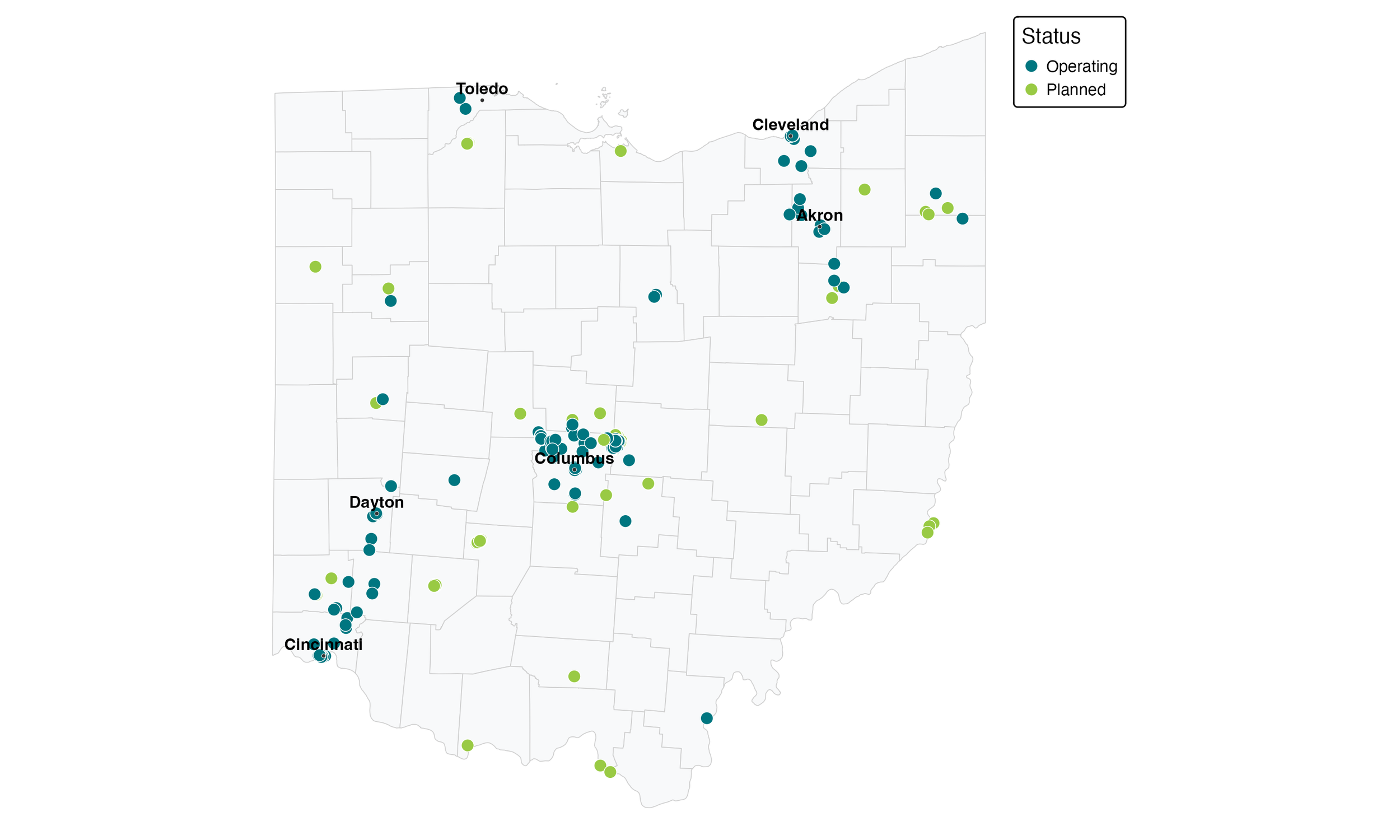
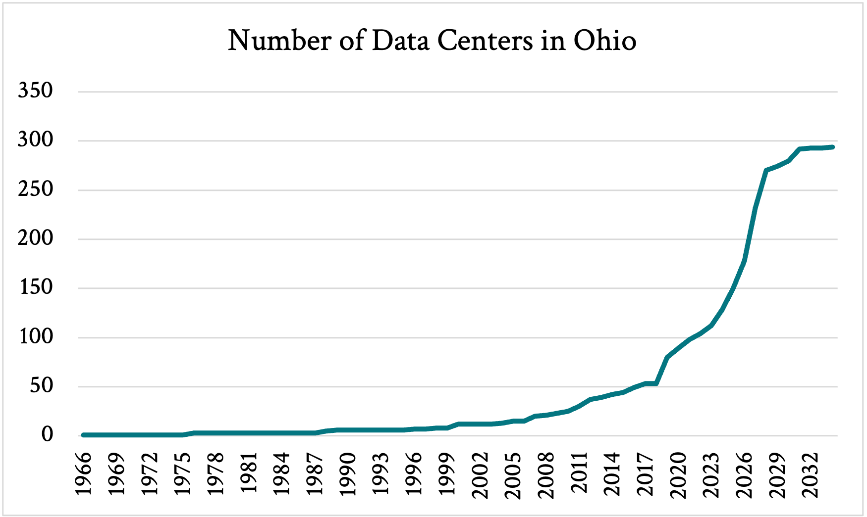
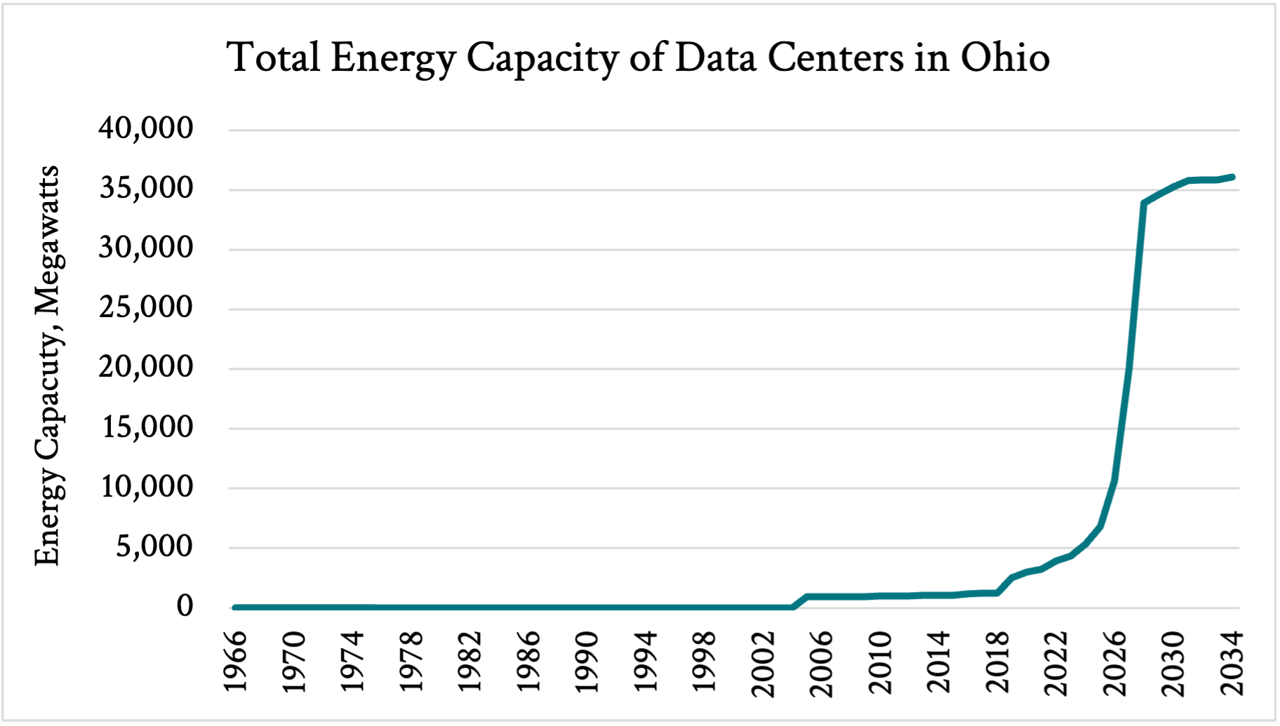
This could lead to more blackouts, especially as growth in energy demand is leading to more users taxing the power system.
Ultimately, this policy represents a bet that utility increases over the next year will not be used for essential maintenance, efficient grid modernization, or reliability upgrades that outweigh the short-term benefit the freeze would have for household incomes, especially for low-income households.
If Rep. Tims is right, this could mean better outcomes for households at little cost to the public.
If she is wrong, the short-term benefits would come at the cost of a quicker degradation of the grid, which means more blackouts and could lead to higher costs in the long run.
While there is part of me that wants to see if her bet is correct, there is another part of me that thinks a more targeted policy, like an earned income tax credit expansion, would achieve the same boost to household income without the potential costs to the grid.
We’ll see if the General Assembly has an appetite for either.
This commentary first appeared in the Ohio Capital Journal.