On Tuesday, the state of Ohio crossed the 2,000-death threshold for COVID-19. The crisis is far from over over, but in this moment when restaurants and other businesses are opening back up, we have an opportunity to look at what COVID-19 has looked like in Ohio so far. First, let’s look at cases.
Data from Ohio Department of Health and US Census Bureau.
The most concentrated outbreaks by far have been in Marion and Pickaway counties, home to two medium-security correctional institutions that were revealed to have serious outbreaks through widespread prison testing. As can be seen from above, the third- through tenth-most concentrated counties don’t even compare to the top two counties in cases per 100,000 residents.
Data from Ohio Department of Health and US Census Bureau.
Deaths are more spread out than cases by county, suggesting that testing was behind some of the large numbers in Marion and Pickaway counties. That being said, Pickaway county is still the third-highest in the state for deaths, which means the outbreak may be more severe in this county. The top 10 counties for deaths per 100,000 residents are mostly suburban, but with some urban and rural counties included as well.
Data from Ohio Department of Health.
Ohio’s deaths have been heavily skewed towards older residents. About half of Ohio’s deaths were among people age 80 or older, three quarters were among people 70 or older, and more than 9 in 10 were people 60 or older. Only 3% of Ohio’s deaths were among those younger than 50 and there have been no recorded COVID-19 deaths in Ohio among children or teenagers.
Data from Ohio Department of Health.
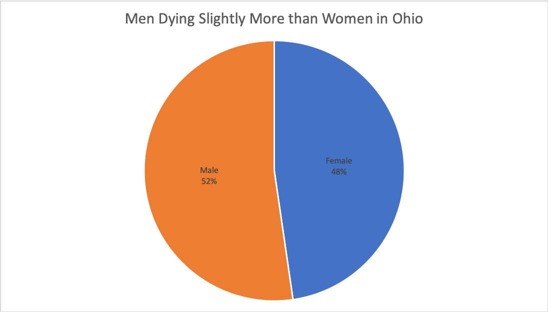
Brookings reports that in each the ten countries with the most COVID-19 deaths, men outnumber women in number of deaths. In eight of these ten countries, men are dying in numbers 50% higher than women and in the Netherlands the number of men who have died is more than double the number of women who have died. In Ohio, we are seeing a lot more parity between men and women when it comes to deaths than in these countries.
Data from Ohio Department of Health.
We haven’t heard the phrase “flatten the curve” a lot recently, but that was the original goal of social distancing: to ease the burden on our medical system so everyone who needed treatment could get it. This means that looking at cases or death rates is not the appropriate chart to judge our success with, it is tracking hospital admissions. Hospital admissions reached a peak at about the very end of March, declined sharply through the first half of April, stayed steady through the second half of April, then declined gradually throughout May. Ohio still has a while to go in the COVID crisis, but if we play our cards right, we might be past the worst of it.


